Saturday, August 10, 2013

A Star Wars Layout (SOS)

Note: If you are looking for my "10 on the 10th" post, rest assured that it's pre-scheduled to go live later today.

I never miss an opportunity to add "spacey" embellishments to my layouts.  This week the challenge at Shopping Our Stash is to use anything related to the sky.  I made a 12x12" scrapbook page called "Star Wars Stars."
 
Supplies: purple cardstock from Wausau Paper; patterned paper, stickers, die cuts, & buttons from October Afternoon; pens from Zig; twine from Crystal Palace.

Star/outer space references abound on my page.  All of the October Afternoon supplies that I used are from last year or earlier, so this was a good exercise in stash-busting.


My journaling tells which particular "stars" of Star Wars my son and I got to meet at this event.  He enjoyed "meeting" a remote-controlled R2D2, while I liked meeting Troy Denning, author of Tatooine Ghost.  When I told Mr. Denning that Tatooine Ghost is my favorite Star Wars book, he got a sheepish look on his face and said, "Yes, that's my chick lit book."  Nothing to be sheepish about, Mr. Denning.  Chick lit, especially well written chick lit, sells!


The main design area of my layout is the photo/card cluster at the bottom.  I balanced it with a cute trio of buttons at the top.


This scrapbook page is a sort of sister layout to "Stormtroopers are Cool," a layout that I blogged about previously.  The two pages, though they do not comprise a two-page layout, will appear next to each other in my scrapbook.

Thanks for stopping by my blog today.  May the Force be with you!  :)

Sunday, August 4, 2013

August Scrap for Help Reveal: Tea Bags!

Hi everyone, entries are now being accepted for a new challenge at Scrap for Help!  Will you play along with us this month?  All you have to do is use a tea bag in your project.  For my sample, I used herbal tea bags (blackberry flavor) to dye the strips of canvas on my layout, which is called "Medicine Garden."

Supplies: background paper by Lawn Fawn; photo mat paper by Kaiser Craft; quote paper by Graphic 45; die cut tab, journaling card, & alphabet stickers by October Afternoon; canvas strip by Canvas Corp.; word sticker by Lily Bee; puffy sticker by Studio G; thread by DMC; ink by Clearsnap; colored pencils by Faber- Castell; photo collage service by Walgreens.com.

What, you ask, is a medicine garden?  It's a collection of plants that were traditionally used for medicinal purposes.  The garden shown in the photos contains plants traditionally used by the Dakotah Indians of the Twin Cities area.


I like the uneven, muted look that the tea dye created on the canvas strips.


Here is the process that I used for obtaining that tea-dyed effect.  After making myself a cup of tea, I transferred the tea bag to a plastic container, along with the canvas strips and some fresh water.  To get a dark enough color, I ultimately added two more tea bags to the dye bath.  So, if you want to try this method of fabric dyeing, I recommend you choose a day on which you'll want to drink lots of tea!  :)


I hung the strips of canvas out to dry.  As you can see, the color of the canvas when it was still wet is a lot more intense than the final color turned out to be after the strips had dried fully.


I wanted the dyed strips to stand out on this layout, so I kept my embellishments to a minimum.  I did do a lot of subtle work with inks and colored pencils, though.


As usual, I had my photo collage printed at Walgreens.  This time, though, I tried a new feature of their printing service.  Instead of choosing a solid-colored background for my two-photo collage, I used a third photo of the garden as my background.  I love how this turned out, and I'll definitely do it again in the future!


As a final touch, I back-stitched along the borders of the photos.

I hope I've inspired you to get creative with tea bags.  There is plenty more inspiration to be found at the Scrap for Help blog, so do stop by and see us there.  Thanks!

Thursday, August 1, 2013

Pretty Good Month

Today is August 1, and as I look back on the month of July, I have to say that it was an exciting month for me, in terms of scrapbooking news.  Would you mind if I shared my good news with you?  
  • My layout "Zoo ZZZZZZ" won second place at Child's Play Challenges (so watch for my guest designer post there later this month).  
  • My layout "Delicate" won at From Scrappers, For Scrappers.  (I'll be guest designing there in October.) 
  • Furthermore, I was also the random winner at CSI.  My winning CSI entry, entitled "Magic Moment," is one that I have not yet shared on my blog.  I think it's high time I shared it!  So, without  further ado, here it is.
 
Supplies: background paper, alphabet stickers, word stickers, tab stickers, & round sticker from Lily Bee; distressed green paper from Fab Scraps; grey swirl paper & number stickers from My Mind's Eye; quote paper from Graphic 45; grey woodgrain paper from KaiserCraft; fussy-cut paper (used as flower stencil) from Authentique; burlap from Canvas Corp.;border sticker from Doodlebug Design; leaf stickers from Simple Stories; round frame stickers from Basic Grey; stamp & dark green ink from Hero Arts; brown ink from Tsukineko; all other ink from Clearsnap; white cardstock from Pulp; pen from Zig; vintage twine; upcycled admission wristband.

Here are a few detail shots and notes...
 
~the wristband I used to make the banner~


~the banner itself~


~my journaling box~


I saved a scrap of paper that I had used for fussy cutting on a previous project.  I used it as a stencil with various inks to decorate my journaling spot.


What could be more fun than lime green burlap!?!


I pulled a couple strings out of a burlap scrap and used these strings to turn a round sticker into a floral embellishment.


I hope you liked my "prehistoric page!"  :)  Thanks for letting me share all my good news with you.  I hope that good luck is in your future!

Saturday, July 27, 2013

Top 5 CHA Favorites...Past & Present

It's that time of year again...Summer CHA just finished up, so I'm ready to make my wish list.  But before I get to that, I'd like to share with you my top five favorites from the releases that launched at Winter CHA, now that I've had a good, long chance to play with these goodies.

Supplies: green dotted paper & red hexagon paper from My Mind's Eye; blue dotted paper from Bo Bunny; white cardstock & yellow chevron paper from American Crafts; yellow woodgrain paper from Bella Blvd; striped paper from Crate; scalloped paper from Kaisercraft; bracket box paper from Lily Bee; alphabet stickers, label stickers, & blue button from October Afternoon; red button from Blumenthal Lansing; yellow button & teardrop rhinestone from Olla Podrida; ribbon from Berwick Offray; twine from Crystal Palace; paint from Ranger; pens from Zig; flower made from upcycled plastic bag.  And...holy freestyle, Batman!  :)  It just felt right for this page.

First on my list is "Collectable--Remarkable" by My Mind's Eye, which I used for the background on the layout above.  I love the whole collection, but in particular I love the shade of green that it features.  Not mint green, not lime green, not forest green...just plain green.  It's a surprisingly difficult task to find plain green scrapbooking products.  Yay, MME, for coming through with it!

Supplies: arrow paper, rainbow chevron paper, journaling card, & journaling pocket from Doodlebug Design; alphabet sticker & purple paper from Basic Grey; ledger paper & flair badge from October Afternoon; pens from Zig; vintage twine.

Lots of rainbow-hued products premiered at Winter CHA, but my favorite of the bunch (which was also, not coincidentally, probably the brightest of the bunch) was "Take Note" by Doodlebug Design.  The brighter, the better--that's what I say!

Supplies: all patterned paper from Lawn Fawn; all alphabet stickers from October Afternoon; all decorative stickers from Basic Grey; cardstock from Pulp; twine from Canvas Corp.

For cute icons and trendy bokeh patterns, my go-to collection lately has been "Pink Lemonade" by Lawn Fawn.  I used it to make the summery card above.

Supplies: all paper & stickers from Lily Bee; corner punch from Creative Memories; ink from Hero Arts; twine from Canvas Corp.

The thank you card above was made with Lily Bee Design's "Pinwheel" collection.  You can't beat the versatility of this collection, and I love the contrast between the juicy brights and the silvery grey.

Supplies: all paper & stickers from Basic Grey; die cuts from October Afternoon; pen from Zig.

Last but not least, I love the "Knee Highs and Bow Ties" collection from Basic Grey.  It's so easy to mix and match pieces from this range, and the products are great for kid pages.

So, those were my top five product picks from Winter 2013 CHA.  Now I am looking forward to several soon-to-be-released collections from the Summer 2013 CHA.  Here is what I've got my eye on:
  1. "Into the Woods" by Lawn Fawn: if that's not cute, I don't know what is.
  2. "Hello Again" by Carta Bella: I love the designs that Kaitlin Scheaffer puts out through Ormolu, and I'm excited to see her work being picked up by mainstream manufacturer Carta Bella.
  3. "Public Library" by October Afternoon: I'm such a bibliophile, I practically live at the library.  Did OA make this line with me in mind?
  4. "Play Date" by Bella Blvd: ahhhh, pure childhood nostalgia!!!
  5. "Base Coat II" by Kaisercraft: I loved the first Base Coat collection, and I'm ready for a second helping.  And actually, I think this collection might already be in stores.  :)

So, how about you?  What were your favorite product releases from earlier this year?  And which products are on your wish list for the latter part of the year?  I'd love to hear your opinions!  Thanks for stopping by today.

Tuesday, July 23, 2013

Once Upon A Sketch--July

Supplies: 12x12" graph paper by October Afternoon; 8x8" blank papers by DCWV; kraft notebook paper by Cachet; large & small alphabet stickers by Crate; photo corner/bracket stickers by Bo Bunny; upcycled sticker negatives by Bella Blvd & Basic Grey; pens by Zig; chalk by Stampin' Up; watercolor paint by Angora; orange acrylic paint by Plaid; green acrylic paint by Deco Art; Liquid Pearls, Stickles, & all other acrylic paint by Ranger; yarn scraps from my stash.

What is faith?  It is a mystical quality that almost defies definition.  It is a sensation perceived in glimpses--like sparks of light--instead of seen directly.  It stretches wide, like a rainbow arching across the sky, yet it fits inside the human heart.


The ethereal quality of faith is what I tried to depict in this layout, entitled "Growing in Faith," which I made for the OUAS July challenge.  Loosely defined lines, sparkly glitter, and rainbow colors help me portray "faith," all the while staying true to the OUAS growth-themed inspiration image and sketch (pictured below).


In designing my layout I used negative sticker scraps, bits of yarn, acrylic paint, and watercolors too.  My journaling says: "Not much grows in the winter, especially in Minnesota, but it's a good time for faith to grow, as we stay inside and become more contemplative.  On Candlemas (February 2) we get out A.'s Baptism candle and talk about its special meaning."


Thanks for joining me today as I shared a page with a deeper meaning.  It was fun to try something a little different.  I hope you have enjoyed it.

Monday, July 22, 2013

Scrap Around the World--July

Hello, everyone!  Did you get a chance to create something over the weekend?  Just as I had hoped, this past weekend I was able to play with paper a bit.  I played along with the June challenge at Scrap Around The World to create a layout about waffle fries, of all things!  The layout is called "Best Fries in the Universe," and the journaling says: "It is true.  These are the best fries in the universe.  Our must-have menu item at Zobota Café."
 
Supplies: background paper from Prima; fussy-cut spaceship & robot paper from Bazzill; pink paper from Authentique; blue/doily paper from Crate; alphabet stickers from Doodlebug; star sticker negatives from Basic Grey; ribbons from Scrapbook Fantasies; stamps from My Mind's Eye; black ink from Hero Arts; yellow & purple inks from Clearsnap; chalk from Stampin' Up; Stickles & Liquid Pearls from Ranger; pen from Zig.


I used the mood board and sketch from Scrap Around the World.  The muted colors from the mood board were influential in my choice of background, and I added pops of darker colors in the foreground, for contrast.  What I liked most on the mood board was the abundance of ribbon--for example, ribbons holding up the keys, ribbons wrapped around the hearts, etc.  This inspired me to use lots of ribbon on my layout.


In particular I used ribbon to make the "engine fire" of the fussy-cut spaceship.  I was, as you see, also very inspired by all the stars on the SATW sketch.


I stamped this robot, then gave him a dab of Liquid Pearls for his nose.  I also enhanced his eyes with Stickles.


My fussy-cut robot also got enhanced by Liquid Pearls and Stickles.


I also used Liquid Pearls in another way.  I recycled the negatives from some old stickers, by using them as stencils to paint star embellishments on the page.  I also added lots of other little touches--stamping in yellow with bubble wrap, stamping in purple with a gear stamp, shading with chalk, and adding more dabs of Liquid Pearls and Stickles, particularly on the ribbon strips.


I am a bit of a geek at heart, and any time I can use space-themed items on a layout, I am a happy camper.  I hope that you have had fun viewing my light-hearted layout.  And I hope I haven't made you too hungry for waffle fries!  Thanks for taking the time to stop by my blog.

Saturday, July 20, 2013

Summer of Color Week 6

Sage and sepia are the color pairing this week, which is the final week of the Summer of Color.  


Instead of making a scrapbook layout, I did something completely different this time and made a necklace.


The seed beads in the necklace are glass, and the other beads are a mix of wood, glass, metal, and plastic, arranged semi-randomly.


I used many different beads from my collection, and it would be impossible to list all the sources; sadly, some of the bead shops that I used to frequent have closed.  However, the seed beads are the "Woodland" mix from Glass Garden Beads, a Minnesota bead shop that is alive and well.

Thanks for stopping by my blog to check out this post.  I have loved participating in the Summer of Color--it is my favorite blogosphere find of the year!  I'll close this post by reviewing the six Summer of Color projects that I created this year.


week 6 (this week)--sage green & sepia

As you see from the photo above, I still have enough of the "Woodland" seed beads left to make a bracelet to match my necklace.  I guess we all know what my next beading project will be.  :)  But first, I want to do some more scrapbooking this weekend.  I hope that your weekend, whatever it holds for you, will be a great one!


Saturday, July 13, 2013

Summer of Color Week 5

It's the penultimate week of the Summer of Color, and boy do we have a great combo this week: yellow and candy apple red!  I used these colors to create a scrapbook page called "So Playful."

Supplies: all patterned paper from Crate; all alphabet stickers from Basic Grey; heart tag & red twine from Canvas Corp.; enamel heart charm from C-Koop Beads; thread from DMC; milk cap from Jenni Bowlin True Vintage; eyelet trim & slide mount from my stash; vintage game card from Olla Podrida; buttons from Blumenthal Lansing; stamp from My Mind's Eye; ink from Clearsnap; yellow pencil from Faber-Castell; watercolor paints from Angora; pens from Zig.

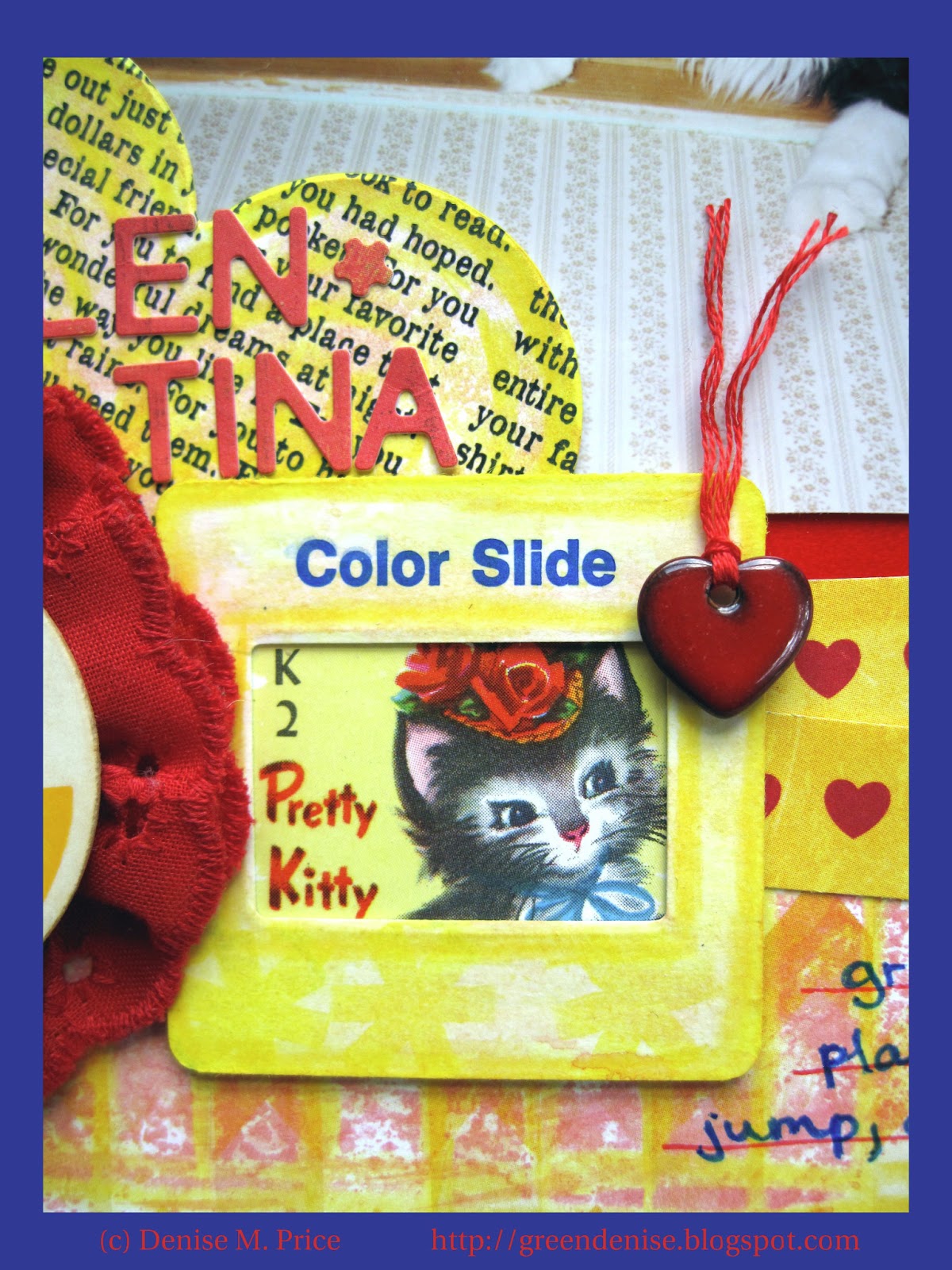
The technique I tried this week was using a slide mount as an embellishment.  I love the faux vintage slide mounts that Crate Paper released as part of their "The Pier" collection.  They inspired me to dig out some slide mounts that I've had since the 1990's.  I used one of them as a frame for a "Pretty Kitty" vintage playing card.


I enhanced the slide mount, the heart tag, and the background paper on this layout with colored pencil, watercolor paint, and stamping.  I also made a custom flower accent with a milk cap and eyelet trim.


The journaling reads: "Sweet Tina never really grew up.  She stayed playful, loving to run, jump, and pounce."


Tina's real name is Valentina, hence all the "valentine-y" embellishments.  We called her Tina for short.


Thanks, as always, for visiting my blog and checking out my latest project.