Friday, October 31, 2014

Autumn: Dark Side (SATW)


It is I, Princess Leia, here with you again today.  I have temporarily taken over Denise's blog to make two autumn-themed posts.  Did you know that autumn is like the Force...it has a light side and a dark side.  In yesterday's post, I showed you a layout of Denise's that demonstrates how autumn, with all its colorful leaves and beautiful nature, is like the light side of the Force.  But when all those leaves turn brown and fall, we are left with bare branches, cold winds, and grey skies...and that side of autumn is like the dark side of the Force.  So here is a layout of Denise's that shows this Dark Side.

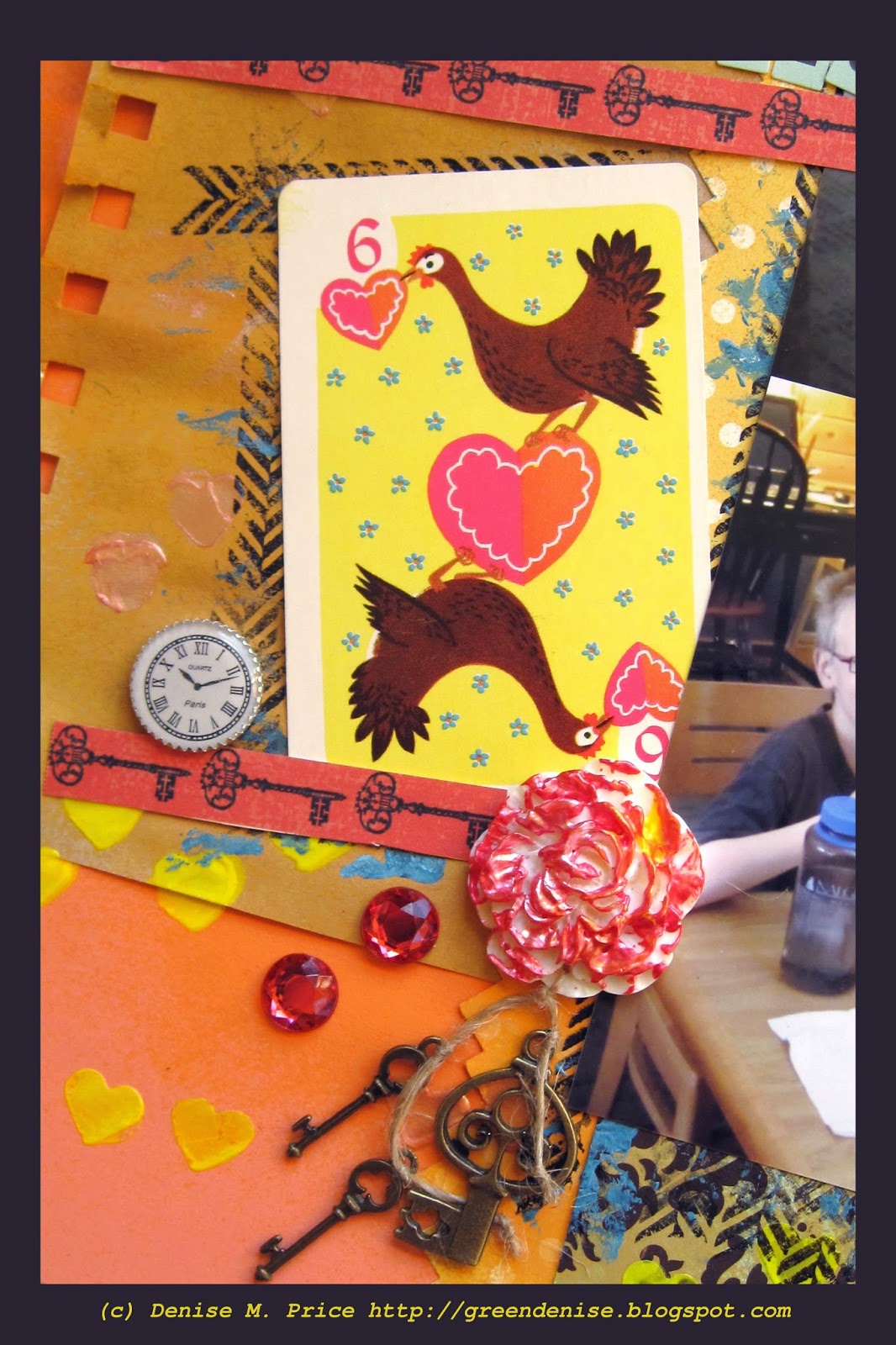
Supplies: cardstock from Bazzill; birchbark paper from Kaisercraft; rub ons & reproduction illustrations from October Afternoon; chartreuse tape from Scotch/3M; clock tape, black roses, & spiderweb charm from Natalie May etsy; chipboard pieces from Scrapmatts; black gesso from Ranger; ink from Clearsnap; butterfly die cut from Dufex; Candi dots from Craftwork; rhinestone from Dee's Place; white netting upcycled from product packaging; striped twist ties upcycled from candy packaging; ribbon upcycled from gift packaging; household pencil.

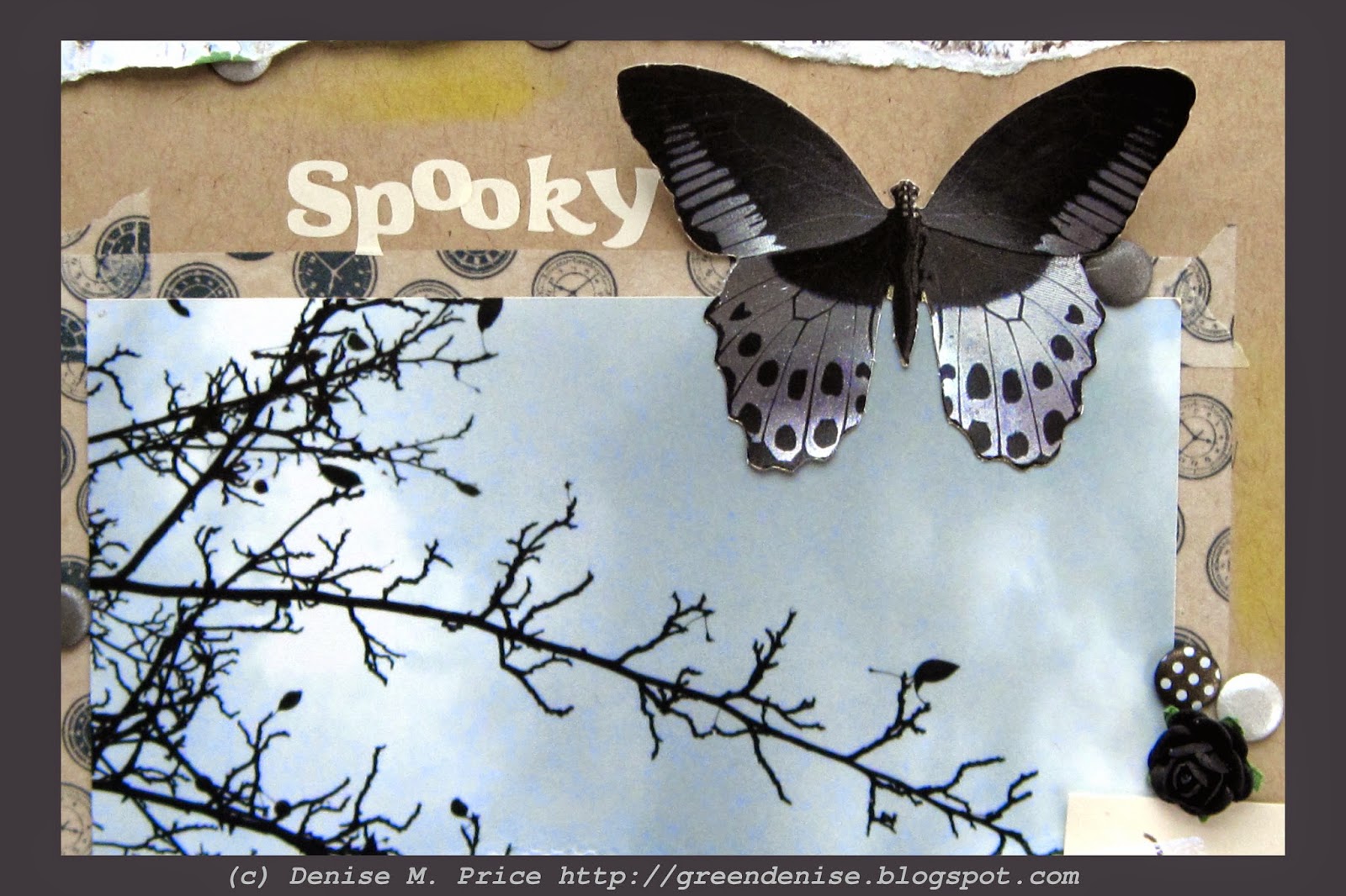
Denise's layout, "Spooky," embodies the dark side of autumn, especially with the two photos.  The chrysanthemums are white, like phantoms in the moonlight...


...and the bare tree branches are like an evil crone's gnarled fingers.


Denise is playing along with Scrap Around the World, and she used the mood board below.  Specifically, she used the photo in the upper left hand corner of the mood board.  Its pale, timeworn, monochromatic look reminded her of the "ghosts" of autumn.


Many details on Denise's page were influenced by the SATW mood board.  These include: the bird cage, the butterflies, the tulle netting, the string of lights (represented by Denise in pops of yellow and chartreuse), and the abundance of white.  Here are a few detail shots of the page.


Thank you for joining me yesterday and today as I took over Denise's blog.  Denise will be back tomorrow, posting her CPC November reveal as usual.  I, Princess Leia, bid you farewell.  May the Force be with you!

Thursday, October 30, 2014

Autumn: Light Side (B71B)


Hi, I'm Princess Leia, and I'm taking over Denise's blog temporarily.  This is the first of two autumn-themed posts that I'll be making. 

Supplies: decorative papers from Simple Stories; kraft cardstock from Wausau Paper; teal cardstock from Bazzill; stickers from October Afternoon; die cuts from Doodlebug Design; Candi dots from Craftwork; pen from Foray; ink from Hero Arts; upcycled wrapping tissue; upcycled bubble wrap; household pencil.

Autumn is like the Force--it has a light side and a dark side.  Here (above) is a layout that Denise made about the light, bright, colorful side of autumn.


Denise drew inspiration from the October Berry 71 Bleu mood board.  It inspired Denise to scrap many photos of autumn leaves. The individual photos are rather small, but as Master Yoda reminds us, "Size matters not."  In fact, by collaging photos onto regular 4x6" prints, Denise was able to fit twelve--count 'em, twelve--photos onto the layout and still have room for patterned paper and embellishments. 


The flowers in the mood board influenced Denise's choice of a flowery background paper.  She also made her own flowers out of upcycled teal wrapping tissue stamped lightly with bubble wrap.


One of the most striking features of the mood board was the way it contrasted cool blue-green (teal) tones with warm autumn colors.  Denise created similar contrast on her page through the use of layered teal cardstock scraps, a few teal stickers, and the aforementioned teal flowers.


The bright colors of October are fleeting, for they soon give way to the grey tones of November.  That path leads to the Dark Side.  If you're not afraid of the Dark Side, then come back tomorrow for my second post on Denise's blog.  I'll leave you here for now.  May the Force be with you!

Friday, October 24, 2014

Photo Share

Hello, hello!  Is everyone having a good weekend?  I hope so!  It has been awhile since I did a photo share post, so I've got one for you today.  "Rustic" is the prompt word this week over at the Our Beautiful World blog, and I have a rustic barn photo for you to see.  I couldn't resist the texture of the weathered wood and peeling paint.


In this next photo, the visible power lines interfere with the rustic effect.  :)  Still, the tree shadow on the barn looks pretty interesting.


This barn is located at a heritage apple orchard.  It grows only "old fashioned" varieties of apples.  The big excitement when I visited was that the orchard staff had just planted some trees of the Frostbite variety.  Although the University of Minnesota developed this variety back in 1922, the trees only recently became available for commercial sale. 


It will be awhile before this little tree starts bearing fruit...


...but in the meantime, the orchard had plenty of other heritage apple varieties ripe for the sampling.  These apples may be "rustic," but they sure were yummy!


Want to see more rustic photos?  Head over to Our Beautiful World and see what the other participants are sharing this week.


Wednesday, October 22, 2014

WCMD Follow-Up

Hello, dear readers!  It's great to catch up with you again.  Today I want to rewind to the beginning of the month, to show you what I made on World Card Making Day (WCMD).


Now, I did share a card back on WCMD, but that was one that I'd made in advance, so that I could post it right away on the morning of October 4.  Later that day, I did get a little time to create, and I made two cards.  They're both very feminine cards; I guess I was feeling girly that day.  Both cards are also made with scraps.  Here's a closer look...

Supplies: kraft cardstock from Neenah Paper; green cardstock from Bazzill; striped/label paper from Pink Paislee; Russian doll paper from Kaisercraft; ribbon from Scrapbook Fantasies; sequin from Natalie May etsy; sentiment stickers from October Afternoon.

I had recently been working with the Kaisercraft "Hidden Treasures" collection for my CPC design team work, and I had some scraps left over.  "Hidden Treasures" includes a lot of Russian dolls images, which I love, since I collect Russian dolls.  I hadn't been able to work any Russian dolls into my CPC layout, so I decided to make a card with a doll as the focal image.  Now that cute Kaisercraft doll graces a card that wishes someone a "perfect day." 

Supplies: stickers & rub ons from My Mind's Eye; papers from Graphic 45; cardstock from Bazzill; ink from Tsukineko; tulle from Wyla; sequins from my stash.

I had also been working recently with some My Mind's Eye and Graphic 45 papers for my Color Room palette 172 entry, and I used the scraps from that project to make another card.  This new card is a Thank You card with an interesting shape and a cute fairy focal image.

The idea of using up scraps to make cards is certainly nothing new, but it's something that I don't always have time to do.  It was very gratifying to finally have the chance on WCMD.  It was also fun to play around with feminine focal images.  Which one do you like best--the doll or the fairy?

Wednesday, October 15, 2014

Inspired by Alice in Wonderland for CPC

Welcome back, blog readers!  Today I have the pleasure of sharing Child's Play Challenges' mid-month challenge with you!  This time around, we invite you to create a layout inspired by the classic Disney film Alice in Wonderland.

Supplies: cardstock from Wausau Paper; fussy-cut butterfly & key patterned papers from Kaisercraft; spray mist, mini alphas, & all other patterned paper from October Afternoon; heart punch from All Night Media; round alphabet stickers from Bella Blvd; acid-free notebook paper from Cachet; stamp from My Mind's Eye; paint from Ranger; vintage playing card from Olla Podrida etsy; clock face, key charms, & resin rose from Natalie May etsy; rhinestones from Dee's Place; border punch from EK Success; household twine; pen from Foray.

My sample layout, which you see in the photo above, incorporates a lot of imagery from the film.  I used a playing card, a clock, keys, hearts...


...and even a [resin] rose painted red!


My page is called "Cards & Cupcakes," and it will go in my Spring Break album.  My family visited northern Minnesota during spring break, and you know, in Minnesota, the spring can be a lot like winter, with cold temps and lots of snowfall.  Here is what my journaling has to say about that: "Being snowed in at the hotel was no problem.  We brought our homemade cupcakes and a pack of cards to the lobby and had fun."


If you saw my last blog post, then you saw how I created DIY stencils for this page.  I took a bunch of little paper scraps, punched heart shapes in them, and temporarily taped them to my background page.

Ready to stencil the background!

Usign pearlescent Stickles paint, I stenciled the hearts onto the background.  I immediately removed the stencils and let the Stickles dry, then I spritzed parts of the background with peach spary ink in a shade slightly darker than the cardstock.  The slick surface of the Stickles resists the spray ink, helping the hearts stand out even more.  This was a fun way to get some use out of little paper scraps and add excitement to an otherwise plain cardstock background.

After stenciling & adding mixed media: hearts galore and a unique background!

If you are interested in creating your own Alice-inspired layout, please share it with us at Child's Play Challenges.  This challenge, as well as our Jack in the Box challenge, are open until the end of the month.  You can link your entries via the linky tool in the sidebar of the CPC blog.  Happy scrapping!

Friday, October 10, 2014

10 on the 10th--Favorite Color Combo


What have we here?  Lots and lots of hearts!  I "heart" the color combo that I used this month for my Ten on the Tenth projects, and I can't wait to show you what I made!  Let's get started. 

10 supplies: items 1 & 2 (cardstock)--brown & turquoise from Bazzill; items 3 & 4 (patterned paper)--damask & polka dot scraps from October Afternoon; items 5 & 6 (embellishments)--die cut letters from October Afternoon & chipboard chevrons from Scrapmatts; items 7 & 8 (throwaway items)--torn doily & charm from broken necklace; items 9 & 10 (nonconsumables)--border punch from E. K. Success & stamp set from My Mind's Eye.

What is "Ten on the Tenth" all about?  On a monthly basis I pull ten items from my stash and form a kit.  Then I challenge myself to use the kit to create three projects--a card, a scrapbook page, and a use-up-the-scraps project.  Each month I choose a different theme or color scheme for the kit.  This time I chose a turquoise/gold/brown scheme, and you can see my kit pictured above.  I've enjoyed creating with this color scheme in the past (for example, here and here), so I thought it would be fun to really focus in on these colors for a month.


First up I want to show you the card that I made.  When I send out the baby onesies that I dyed over the summer, this card can accompany the gift.


I liked the design that I used last month for my Color Room card, so I used the same design for the baby card.  While the two cards differ in style, the design is the same.  Why reinvent the wheel?  Sticking with a familiar design speeds up the creative process.


I'm also sticking with my theory that a combination of hard textures (like enamel dots) and soft textures (like paper frills and a puffy sticker) helps create a successful design.  I have an analytical mind, and I like to try to figure out the nuts and bolts of how something like design works.

~previously blogged here~

Regular readers of my blog have already seen the scrapbook page that I created with my kit.  If you missed it, here it is again.  As with the card, I focused on using contrasting textures when I created this layout.


Now we're back to where we started with this post: a heart-filled photo.  After creating a card and scrapbook page with this kit, I had only a few, oddly shaped scraps left.  I grabbed a sheet of peach cardstock and stuck the larger scraps to it, to form the foundation of a scrapbook page.  To use up the smaller scraps, I punched hearts in them and used them as stencils.  (That ledger print is the flipside of the damask paper.) 


The cardstock that I decorated with these scraps and stencils became a layout for my newest Child's Play Challenges design team sample.  That layout will go live, both here and on the CPC blog, on October 15.  In the meantime, I've left you with just a little sneak peek image.  I hope you'll be able to come back on the 15th for reveal day.  In any case, thanks for stopping by my blog today, to see my card, my layout, and my use-up-the-scraps process for this month's Ten on the Tenth kit.  Happy scrapping!

Saturday, October 4, 2014

Happy World Card Making Day!

Supplies: all paper, die cuts, & stickers from October Afternoon; ink from Tskukineko; kraft envelope from Canvas Corp.

Hi, everyone!  It's a cold, cold, cold autumn morning here.  The furnace is on, and I'm snuggled under some blankets with my laptop and a cup of hot coffee.  As we say good bye to summer, I thought I'd share this card, which I made for a child's birthday.  The card has all my favorite summer colors--the serene blues of Minnesota lakes and skies, plus the gem-like greens of grass and trees and lily pads.  But the golds and browns of autumn are there too.  At this time of changing seasons, it just seems like the perfect day to share this card.  Happy World Card Making Day!


Wednesday, October 1, 2014

Jack in the Box--October CPC Challenge

Hi, everyone!  Wow, we had such a great response to our September CPC challenges.  Let's keep it rolling with our first October challenge, which goes live today.  This month we invite you to create a page inspired by that classic childhood toy the Jack in the Box.  I made a zoo page for this challenge.

Supplies: cardstock from Bazzill; all paper from Kaisercraft; spray mist, enamel shapes, & large alphabet stickers from October Afternoon; mini alphabet stickers from Doodlebug; ink from Tsukineko; stamps from My Mind's Eye; chipboard from Scrapmatts; doilies, sequins, flowers, & ribbon from Natalie May etsy; pen from Foray.

I was lucky in that I had some paper ("Hidden Treasures" collection by Kaisercraft) that included a cute picture of a Jack in the Box monkey.


No Jack in the Box paper in your stash?  No problem!  You are free to interpret this challenge in any way you wish.  You could make a page about clowns, about someone named Jack, or about something in a box.  Please be sure to visit the Child's Play Challenges blog for even more ideas from the rest of the design team.  Happy scrapping!