Monday, October 29, 2012

Altered Journal

ETA: Oh my goodness, I was featured at both Scrap for Help and Shopping Our Stash!  I'm so honored--thanks, ladies!


Fair warning: this is a photo-heavy post!

I've been wanting to start an art journal for some time now.  It just seems like a fun, freestyle form of self-expression.  Since autumn is a very inspiring time of year for me, I decided to alter a pocket-sized sketch book to create an "I Love Fall" art journal.

Supplies: Earthbound sketch book by Cachet; woodgrain paper by My Mind's Eye; text paper by Echo Park; die cut paper by Graphic 45; stickers by Simple Stories; rub ons by Hambly; buttons by October Afternoon; star beads by Darice; sea glass beads by Jeff Plath of Glass River Beads; ink by Tsukineko; glitter & pearlescent paint by Ranger; matte white & metalic green paints by Deco Art; Apple Barrel orange paint by Plaid Industries; sewing thread by Singer; recycled elements: assorted yarn scraps & corrugated cardboard from an old box.

I'm entering this altered journal in three challenges:
  1. Scrap for Help--October Challenge--use recycled materials, including string/fibers
  2. Berry71Bleu--October Challenge--mixed media
  3. Shopping Our Stash--Challenge 74--use a jar

First, I gathered the recycled materials (pictured above) that I planned to use in my project.  As you can see from the photo, the sketch book that I used is made with recycled paper.  I also used a piece of corrugated cardboard torn from an old box.  The odds and ends of leftover yarn were given to me by a friend who has a knitting business.


Then I gathered the wet media that I planned to use.  I chose two colors of matte acrylic paint, one color of metallic acrylic paint, three bottles of Liquid Pearls, and one bottle of Stickles.  I began my project by dry brushing some white acrylic paint onto the cover of my journal.


Next, I used a technique called string printing, which seemed like a natural fit for Scrap for Help's string challenge.  I mixed together metallic green paint, blue Liquid Pearls, and white Liquid Pearls.  I dipped an arm's length of sewing thread in this mixture, then let the string fall in random swirls atop the journal cover.  I left a little bit of the thread hanging off the right-hand edge of the journal cover.


I placed a piece of scrap cardboard over the journal cover and held it down with my left hand.  I grasped the end of the thread with my right hand and pulled it out.


After I removed the cardboard from the journal cover, this is how the string print looked.


I repeated the string printing technique three more times, varying the placement of the thread.


For the next step in my process, I tore the top sheet off a scrap of corrugated cardboard to expose the inner ribs.  I brushed a mixture of red Liquid Pearls, white Liquid Pearls, and orange paint onto the cardboard.  Then I randomly squirted swirls of red Liquid Pearls and globs of purple Stickles onto the cardboard. 


I used my paint-covered piece of cardboard to stamp on the journal cover, and the photo above shows how this looks.  I love the interplay of the different layers, textures, and colors.


Once the paint was dry, I went on to add some buttons, beads, yarn, and paper elements.  It almost seemed a shame to cover up so much of the paint work that I had done, but I left quite a bit of it showing around the edges of the journal.


Here's my jar, which fits the theme of the Shopping Our Stash challenge.  Simple Stories often has these jar stickers in their collections.  As far as I'm concerned they could have one or two in EVERY collection that they put out!


The sentiment stickers also come from Simple Stories.


As you can see from the above photo, I also used paint to enhance my papers.  The edges of the woodgrain paper are dry brushed with the same mixture that I used for the string printing.  The torn die cut paper is dabbed with the same mixture that I had brushed onto the corrugated cardboard.


Now let's talk about how I used the different types of yarn.  As you see from the photo above, I stitched down a row of sea glass beads with a strand of the dark green yarn.


I threaded the buttons with a single strand of the the light green yarn.  I love the way it curls--this reminds me of pumpkin vines.


The crowning feature of the journal is this mass of rainbow yarn.  First I knotted individual pieces of yarn around the spiral binding of the journal.  Then, for a finishing touch,  I wove a longer piece of the same rainbow yarn in and out of the metal spirals, adding a few star beads.


To me, the decorations on this journal symbolize everything that is great about autumn, from the bright colors of falling leaves to the excitement of bonfires on cold, starlit nights.  I can't wait to start filling the pages of this new art journal!

Thanks for stopping by today and sticking with me throughout this long post.  

Friday, October 26, 2012

October Afternoon Weekend

For Twin Citians, there are a lot of discounted October Afternoon goodies to be had this weekend.  October Afternoon is having their warehouse sale, and Scrapbooks Too has all their October Afternoon products on clearance as well.  Actually, they have ALL their products, not just October Afternoon, on clearance.  The store owner got a new job in the papercrafting industry, so she is closing the store.  Her gain is our loss, though--I am really going to miss that place.  If you're going to the OA warehouse sale this weekend, you should definitely stop by Scrapbooks Too as well.

Supplies: background paper by Studio Calico; mini alphabet stickers by Lily Bee Design; all other stickers by October Afternoon; journaling line template by Creative Memories; pen by Zig; red pencil by Faber-Castell.

Since this weekend seems to be all about OA, I decided to share an OA layout on Green Crafting today.  The layout you see above is called "Victory Parade," and it was published in the July, 2012 issue of Scrap n' Art magazine.  That issue had a flag theme, and my layout for it concerns a parade honoring the Russian holiday День Победы, which in America is known as Victory in Europe (V-E) Day.


This flag bearer sticker, from OA's "Sidewalks" collection, was the perfect accent for this page.  I mixed and matched  letter stickers from "Sidewalks" and "Fly a Kite" to spell out the word "Parade."

The photos on this layout are from 1995, when I was studying abroad in Saint Petersburg (formerly known as Leningrad).  The journaling reads: "V-E Day is an incredibly important day in Russia.  I was lucky enough to see the celebration of the 50th anniversary of V-E Day while I was in St. Petersburg.  There was a parade to honor the old soldiers, and the streets were festooned with decorations.  It was lovely." 


I wrote my journaling by hand, but I spelled out a few key words with Lily Bee mini alphas.

Thanks for stopping by my blog today.  Whether or not your weekend involves October Afternoon, I hope it will be a great weekend for you.

Sunday, October 21, 2012

Bonjour, Bead Bazaar!

Hello, friendly readers!


Are there any special craft-related events that you try to attend?  A favorite of mine is the twice-yearly Twin Cities Bead Bazaar.  The fall bazaar just took place this past weekend in suburban Minneapolis, and I was able to find a little time to stop by and hunt for new treasures.  That's what the bead bazaar feels like to me: a treasure hunt!  At the event you'll find stall after stall of vendors, each selling different kinds of beads, buttons, and charms.  The three photos below, which are from the spring 2011 bazaar, should give you and idea of the fabulous crowds, colors, and delights that you find at these events.


I have not yet had a chance to "play" with my newest purchases, but I thought I'd show you a card I made with a charm from a previous bead bazaar.  It's a "hello" card with an elegant French vibe.

Supplies: all papers and rub ons by My Mind's Eye; alphabet stickers by Echo Park; tulle ribbon by Wyla; roses by Marianne Design; rhinestones by Petaloo; jump rings by Vintaj; charm by Trinket Foundry.

The fleur-de-lis pendant on this card comes from a Minnesota company called Trinket Foundry.  I try to buy a few items from Trinket Foundry (sold via the Glass Garden Beads booth) at each bead bazaar.  Cathy Collison, the force behind Trinket Foundry, is the ultimate green artist.  All her beads and charms are made from recycled materials.  This fleur-de-lis charm, for example, is punched from an old metal file cabinet!


Trinket Foundry baubles are a bit pricey, but to me they are worth every penny.  For the price of one charm, I could probably buy a whole pack of charms at a scrapbooking store.  But the mass-produced charms at big box stores are made overseas in factories.  Trinket Foundry goods, on the other hand, are made right here in Minnesota, so I know that the shipping costs involved are minimal, and the artist is earning a fair wage.  So, this fleur-de-lis is truly a treasure, and I'm so glad that I found it at the Bead Bazaar.

Wednesday, October 17, 2012

Beach House Home Decor

I'm back today to share another project that I had published in the August issue of Scrap n' Art.  This is a "beach house" style altered picture frame.

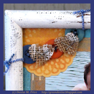
Supplies: recycled frame; acrylic paint by Deco Art; teal/purple patterned paper by FabScraps; tan/green patterned paper by Paper Loft; alphabet stickers by Lily Bee; all other stickers by My Mind's Eye; buttons by October Afternoon; burlap by Canvas Corp.; twine by Crystal Palace; household stapler and sandpaper.

Oh, how I love sunny summer days at the beach!  To capture that feeling, I wanted to frame this old photo of my son and husband.  Although I've often seen the "beach house" style depicted in magazines, I had never attempted it before.  (As I Minnesotan, I tend to gravitate more toward a "northwoods" home decor style.)  But now that I've had the enjoyable hands-on experience of distressing the frame, I will definitely use this style again.


It's easy to give a "beach house"-style makeover to an old frame from a thrift store.  Lightly sand the frame, then apply a coat of white acrylic paint.  While the paint is still wet, press some burlap into it at random spots, to add a little texture.  While you're waiting for the painted frame to dry, layer together papers, stickers, and a special photo to fit inside the frame.  After the frame is dry, lightly sand it in random spots, to simulate a weather-worn look.  Embellish the project with buttons, stickers, twine, staples, and hearts cut by hand from the paint-stained burlap--and then your project is done! 


Now it's autumn, and the warmth of summer is fading fast, but I'll always have this home decor piece to brighten my days.

Tuesday, October 16, 2012

Summer Trees

Today and tomorrow I'll be sharing with you some projects that I had published in the August 2012 issue of Scrap n' Art.  The layout I'm sharing today is a called "Trees of Summer."

Supplies: zigzag paper by Echo Park; striped paper & pale blue paper by Authentique; leafy patterned paper by Creative Imaginations; tree patterned paper by FabScraps; green dot & solid brown papers by My Mind's Eye; botanical textbook paper by Jenni Bowlin; die & cutting machine by Ellison; title sticker, date sticker, & flags by October Afternoon; mini alphabet stickers by Lily Bee; owl, tree, flower, & border stickers by Creative Imaginations; acrylic paint by Plaid; pen by Zig; household stapler.

I photographed these groups of trees at the University of Minnesota Landscape Arboretum.  I love all the different shades of green represented among the foliage.


I used lots of shades of green in my layout, and I also added summery splashes of orange.


I added a bit of whimsy, too, with butterflies, flags, and a cute little owl.


People always talk about how beautiful trees are in the spring, when they are in bloom, or in the fall, when leaves are changing colors.  But I think it's important to appreciate the "everyday beauty" of green trees in the summer, too.

Thanks for stopping by my blog today!  I'll be back tomorrow with another summery post.

Saturday, October 6, 2012

World Card Making Day

Happy World Card Making Day!  I think that cards for males are the most challenging to make, so today I'm sharing an idea for a "little boy" card.

Supplies: cardstock by Yours Truly for Archivers; papers by Bella Blvd; chipboard by October Afternoon; stickers by Crate Paper; rickrack by Wrights; punch by Creative Memories; pen by Zig.

This square card has a fun size and shape.

Additional supplies for inside of card: graph paper by Bella Blvd; stickers by Echo Park; buttons by October Afternoon; pen by Zig; thread by DMC.

You've seen this quote before on coffee mugs and tee shirts.  But have you ever seen it spelled out in mini alphas before?  :)  This card was really fun to make.  I hope you've enjoyed looking at it as much as I enjoyed making it.

Friday, October 5, 2012

Variation on a Theme

Hello again!  I've got another Color Room layout to share with you today.  Like I wrote about in my last post, I again used the Graphic 45 "Domestic Goddess" alphabet sheet to add a pattern of circles to this layout, called "Rings."

Supplies: cardstock by American Crafts; tulle ribbon by Wyla; thread by Singer; starry paper & thimble label by Echo Park; distressed white paper by Authentique; button card by October Afternoon; die cuts & alphabet stickers by Lily Bee Design; chipboard butterfly by DCWV; doily by Royal Consumer Products; lace by Jeanette Crews Designs; distress stain by Tim Holtz for Ranger; die cut circle paper (used as mask) by Graphic 45); pen by Zig.

I made this layout for Palette #130, which is a "whitewashed" palette.  This means that the palette is comprised of white plus three hues of the same color--berry pink, in this case.  An additional requirement for this palette was to incorporate polka dots into the design.


I incorporated polka dots in a few different ways, and I even found in my stash some Lily Bee alpha stickers that were raspberry pink with lighter pink dots!


I also used some circular elements (including die cuts and a doily), to play up the dots.  The circles, plus the romantic color palette, made me think of engagement/wedding rings.  The journaling on my layout reads: "Our engagement rings were local Black Hills gold.  We loved their colors so much!  They're "so us!"" 


I read on Wikipedia that in times past thimbles were sometimes used as engagement rings.  Intrigued by that bit of information, I decided to incorporate a raspberry pink thimble image into my design.  Continuing in the sewing vein, I also incorporated a button card and a scrap of lace, and I sewed lengths of tulle to my layout in the form of a frame.


Do you remember this cluster of foam flower stickers, from a previous Color Room layout?

I saved the backing pieces from those flowers, because I liked their translucence.  I tucked a few of these backing pieces behind the tulle on my "Rings" layout, creating a white-on-white look that has a "wedding" feel to it.

I had a lot of fun creating this page for my wedding album.  Thanks for stopping by my blog to check it out today.

Monday, October 1, 2012

My Favorite Alphabet

Welcome to October!  Since it's the first day of the month, new magazine issues have just come out.  I'm pleased to share that I have two layouts published this month--one in Scrap n' Art, and the other in ScrapStreet.  Both layouts celebrate fall.

In my last post I shared a card with an autumnal blue/brown color scheme.  Today I have a layout to share with a similar color scheme.

Supplies: cardstock by Bazzill; border stickers by Doodlebug Design; journaling spot, title spot, and photo corner stickers by Bella Blvd; acorn, heart, & alphabet stickers by Simple Stories; label stickers by October Afternoon; round die cuts by Graphic 45; faux brads by Craftworks; ink by Tsukineko; pen by Zig; buttons upcycled from old clothing.  Color inspiration by The Color Room palette #125.

The journaling on this layout reads: "Halloween can be sad if peanut allergies prevent you from eating your candy.  Luckily we found two peanut-free Halloween parties this year."  The photo on the left side of the layout is from a candy-free party at the library, and the photo on the right shows my son's peanut-free loot from an old time Halloween party put on by the Ramsey County Historical Society.  I tried to recreate a party atmosphere on my page, with a "confetti and streamers" type of look.

In particular, I want to draw your attention to the dotted die cut circles on the page.  These are from what is, in my opinion, the coolest alphabet sheet ever!  It's the "Domestic Goddess" alphabet by Graphic 45.  


This is an older alphabet set.  You saw me use it last year, to add my husband's and my initials ("S & D") to this anniversary card (blogged here).  Since that time, I've been left with letters that don't really spell anything, but that doesn't matter.  Each alphabet circle can be flipped over to use as an embellishment.  See the dark brown circles with the lighter brown dots in the closeup below?  Those are the reverse sides of random letters.


What I love most about this alphabet set is that every single part of it is useful.  The letters can be used for titles--as I showed with the the anniversary card.  Any leftover letters can be used as embellishments--as I showed with the Halloween layout.  And once you've punched all the die cut circles out of the sheet, you can use the leftover sheet as a mask, in order to add a patterned background to projects using wet media.  You'll find an example of this masking technique below.

Supplies: Double Dot cardstock by Bo Bunny; woodgrain paper by October Afternoon; cross hatched patterned paper by Bella Blvd; dotted paper by My Mind's Eye; border stickers by Bella Blvd; alphabet stickers by October Afternoon; mini alphanumeric stickers by Authentique; die cut labels by October Afternoon; die cut circle pattern (used as mask) by Graphic 45; Distress Stain by Ranger; ink by Clearsnap; tulle ribbon by Wyla; corner punch by Creative Memories; pen by Zig; household stapler.

Did you spot the subtle circular pattern on the navy blue cardstock?  And the bolder circles near the title and labels?  These were all created by using Distress Stain with the Graphic 45 die cut paper.

I hope that in the future more companies will make multi-purpose, no-waste alphabets like this.  Fingers crossed!