Friday, February 22, 2013

Roses are Red, Violets are Blue

And now, for something completely different from my last post...

Supplies: cardstock by Wausau Paper; green patterned paper by Crate; word stickers & grey lattice paper by My Mind's Eye; grey dotted paper by American Crafts; text paper, alphabet stickers, die cuts, label stickers, flair badges, & recycled packaging by October Afternoon; faux brads by Craftworks; flower by Petaloo; pens by Zig; recycled envelope.

Lately I've been in the mood to create layouts that are both simplistic and layered, even though that seems like a contradiction in terms.  I've found a way to make this simplistic/layered combo work, by sprinkling a few layered clusters around the pageThen I use lots of white space in between the clusters--as I've done with the layout above.  I'm entering this layout, called "In Sickness and in Health," in the February Berry 71 Bleu challenge, which is all about using white space.  Since I've been really into the color combination of blue and red lately, my white space on this page is actually "blue space."  :) 


And for the red, I used a bright red envelope (from a Christmas card that I received last year) as a title block.  I've always enjoyed using postal elements on my pages, but I've been really, really into it so far this year.


Yeah, I know, Christmas was a while ago.  But I've been thinking a lot about what this past Christmas meant to my husband and me, and this page is what came out of those thoughts.  Plus, a Christmas page is the perfect excuse to use my favorite star embellishments.  :)  My journaling, which is written in the form of a note to my husband, says: Last Christmas (2011) I was so glad you were recovering from your ankle surgery.  This year I'm so glad I'm recovering from my ankylosing spondylitis flare.  Thanks for taking care of me.  I'll always take care of you. 

What the heck is ankylosing spondylitis, you ask?  It's a genetic disorder that causes back problems.  It's one of those things that is well controlled for a while...until I suddenly have a flare.  I had a flare this past autumn, but by Christmas I was starting to recover, thank goodness.


Flares are a bummer, but flair is so good.  :I used three flair badges (one for each cluster) on this layout, which I think is a record for me, since I tend to hoard them.  They can be difficult to photograph, since they're so reflective, but I'm pretty happy with how my photos for this layout turned out.

Thanks for stopping by my blog today.  Have a good day!

Tuesday, February 19, 2013

Blog Love


The inspiration for "Blog Love," the layout I'm sharing today, comes from all around the Internet.  In this post I'll show you how I combined ideas from The Color Room, Once upon a...Sketch, and Scrap Africa, in order to create this layout.  (Links & explanations are in the body of this post.)

Supplies: white background paper by Authentique; striped paper by Crate; postcard paper by Teresa Collins; newsprint paper by Bazzill; heart paper by Cosmo Cricket; alphabet stickers by Creative Imaginations; ink by Hero Arts; acrylic paint by Deco Art; watercolor paint by Angora; colored pencils by Faber-Castell; pen by Creative Memories; chalk by Stampin' Up; Stickles glitter by Ranger; thread by DMC; faux brads by Craftworks; upcycled postage stamp & clothing button.

I got the color scheme from The Color Room.  Their gorgeous palette #144 (pictured below) is heavy on green, which made me think of my online name, Green Denise.


I decided to be a bit literal and add green to a picture of myself, Green Denise.  I xeroxed (and enlarged) my photo, then cut the image to form a mask.  Below you can see the mask and my "trial run" using it with chalk.


For the actual layout, I used a few different media to create my self-portrait.  First, I repeatedly pressed a black ink pad over the mask.  This created a "grungy" base that gives depth to the image.  Next I swept metallic green paint over the mask.  I then removed the mask and let the paint dry.  Finally, I outlined the image with black pen (for definition) and rubbed black and green chalk over the paint (for subtle shading). 


I purposely placed the mask so that the words "открыткое письмо" appeared in my glasses.  I played a bit with the meaning of this phrase.  Открыткое письмо is the old term for postcard in Russian (now the shorter word открытка is used instead), but it can also mean "open letter."  Since my blog is something of an open letter to the world, I thought it fitting to use the words отрыткое письмо in my portrait. 
  

I also added a hand-stitched border to my portrait.  I got this idea from Once upon a...Sketch.


Now, why is this sketch backwards?  I wanted to show how I used the mirror image of Nadia's sketch to guide my design choices.  Of course, I also followed the journaling prompt from the February Once upon a...Sketch challenge.  The prompt was to write about love...any aspect or type of love.  As the title of my layout implies, I wrote about the reasons why I love my blog.  


Most of my journaling sits to the left of my portrait.  I wrote: "I love being Green Denise, because it lets me reach out to creative people around the world."


I used additional journaling as a design element.  All across my background paper (except in the area masked by the paper dolls) I wrote in blue pencil, over and over again, these phrases: "This is what I love.  This is how I connect.  This is how I love to spend my time.  This is my beloved hobby."  You can see these repeated phrases in the photo above.


The challenge this time around at Scrap Africa is to create a layout with hearts as the main accent.  I used hearts symbolically in this layout.  Since I wanted to emphasized how I love the way that my blog allows me to connect with people around the world, I made a chain of paperdolls whose joined hands form heart shapes.  I used this chain of dolls to mask off the central band of my layout.  I layered color (pencils, watercolors, chalk) over this chain of dolls, as you see in the photo above.


I saved the hearts that were left over from cutting the paper dolls, and I used these hearts, as well as bits of the dolls, to create a decorative border near the lower edge of my portrait.


And, finally, I used a distressed Dutch postage stamp with a heart-shaped Earth as a little banner for one of the paper dolls to hold.

Thanks for sticking with me through this long post, as I've explained how I used three inspirational challenges to create my page.  I hope you've enjoyed learning about the symbolism behind my design choices for this layout.  I've enjoyed connecting with you via my blog today!

ETA:  Great news!  This layout was featured in The Color Room!


Sunday, February 10, 2013

10 on the 10th: Echo Park

It's mid-February...the time of year by which people often have given up on their New Year's resolutions.  That's why I sometimes decide not to make a New Year's resolution--who wants to deal with the stress of potentially messing it up???  :)  But I did make one this year, because I knew it would be easy to keep.  I vowed to use more of my older papers and scraps.


In order to make the goal more specific, I'm going to choose one "file" of papers (I organize my patterned paper into files, some by manufacturer, some by theme) each month and try to use items specifically from that file.  I'm not going to limit myself to only the papers in each month's file, nor am I going to worry about trying to use up all the papers in each file.  I'm just going to have fun and be creative.  For January I used my Echo Park file (pictured above).

I have a whole mix of different colors and patterns among my Echo Park scraps.  So, my first "plan of attack" was to choose a few color schemes that I like and make projects with those.

For this thank you card I chose "candy colors": berry pink, mint green, and buttercream yellow.  Yum!
 
Project 1: All stickers and patterned papers by Echo Park; cardstock by Wausau Paper; Distress Stain by Ranger; tulle by Wyla; embroidery floss by DMC.

Next I used a mix of sunny yellow and crisp blue for this baby card.  I added a bit of decoration to the envelope, too.
 
Project 2: label sticker & all patterned paper by Echo Park; Crate Paper tag used as template for tag on card; alphabet stickers by October Afternoon; epoxy swirl by EK Success; white pen by Ranger; black pen by Zig; corner rounder by Creative Memories; ribbon recycled from gift packaging.

And you've already seen this layout, for which I used a color scheme from Berry 71 Bleu.

Project 3: see previous blog post for supply list and details.

My next strategy for mixing and matching was to use similar patterns.  For the layout you see below, I used a mix of dotted prints (which reminded me of bubbles) and wave prints.
  
Project 4: all patterned papers & alphabet stickers by Echo Park; cardstock by Wausau Paper; stamp & ink by Hero Arts; pens by Zig; recycled envelope & postage stamp.

And with this layout, I combined a variety of chevron prints. 

Project 5: see previous blog post for supply list and details.

My final strategy was to choose one paper with a busy print, then use it to determine the other colors in the project.  For the card below, I drew my color scheme from the butterfly paper.  (I did end up covering some of the butterflies, but you can see the whole sheet of paper and its overall color scheme here, on the Echo Park site.)
 
Project 6: all paper by Echo Park; corner rounder by Creative Memories.

To make a card for my son, I matched Echo Park products to this old game card, which has a car-themed pattern.
 
Project 7: sentiment sticker and all patterned paper by Echo Park; vintage game card from ollapodrida.etsy.com; ink by Hero Arts.

For this New Year's card, I drew my color scheme from the hot air balloon paper.
 
Project 8: sticker negatives from Reminisce used as stencils; label sticker and ticket paper by October Afternoon; all other paper and stickers by Echo Park; green paint by Deco Art; orange paint by Plaid; glitter glue by Ranger; pens by Zig.

You've already seen the layout below.  For this layout, I started with the striped paper along the left side and built my color scheme from there. 

Project 9: see previous blog post for supply list and details.

I followed the same procedure for my tenth and final layout: I started with the striped paper and chose the rest of the colors based on that.

Project 10: sunburst patterned paper by Pink Paislee; kraft cardstock & all other patterned paper by Echo Park; die cut by October Afternoon; mini alphabet stickers by Lily Bee; large alphabet stickers by Creative Imaginations; corner punch by Creative Memories.

And there we have it--five cards and five layouts for a total of ten projects created in January!  During the month of February I'm working with My Mind's Eye products, and I'll post ten MME projects on March 10.

Scrap Africa Sketch #14

Hello!  The layout I'm sharing today is for Sketch Challenge #14 of the Scrap Africa blog.  I love playing along with this blog, where the challenges are varied and interesting.

Supplies: orange alphabet stickers by Lily Bee; Yellow alphabet stickers by October Afternoon; journaling card & stamp by My Mind's Eye; notebook paper by Cachet; background cardstock, tags, & all other stickers by Bo Bunny; paint by Plaid; Stickles & Liquid Pearls by Ranger; pen by Zig; household twine, stapler, & pencil.

Here is the sketch for this challenge...


Since I had landscape-orientation photos to use, I rotated the sketch ninety degrees, like this...


I reinterpreted the butterflies as loops of twine on my tags.  The tags house my title, "Skills of Observation."


I had a lot of fun using the ruffled edges of the notebook pages to add dimension to this layout.


My journaling starts on the journaling card and extends to the notebook page at the top of the layout.  The journaling, in total, reads: "Why is our boy taking notes on the first day of summer break?  Because he is SERIOUS about science!  It was his own idea to take notes.  As we were preparing to leave the house that morning, he called out, 'Wait!  We forgot my notebook!'  We asked, 'Why do you need your notebook?'  'To take notes, of course.'  We made sure to bring a notebook, and it was put to good use.  ~Minnesota Zoo, June 2012~"


Using a variety of techniques, I added paint, Stickles, and Liquid Pearls to the page.  I felt that these media added roughness, shimmer, and dimension that echoed the sand and rocks at the zoo's "dinosaur dig" play area.


I also stamped here and there with an asterisk shape.  First I pressed the clean stamp into a thickly-painted area, allowing the stamp to pick up the paint.  Then I repeatedly stamped the image on the cardstock, until I'd used up all the paint.


This was a really enjoyable layout to create--fun photos, fun sketch, and fun supplies.  Thanks for stopping by to take a look at my creation!

Thursday, February 7, 2013

Bonus Scrap for Help Inspiration

I have two pages to share today.  The first one uses the current palette from the Color Room. 

Supplies: zigzag paper by Kaisercraft; die cuts & all other papers by My Mind's Eye; chipboard letters by Studio G; ink by Hero Arts; corner punch & black pen by Creative Memories; glitter glue and white pen by Ranger; thread by Singer; upcycled map, rhinestone, sequins, & safety pin.

Did you know that Scrap for Help and The Color Room are cross-promoting each other this year?  Combining the two challenges is not required; it's just a fun option.


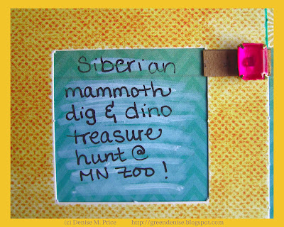
My journaling is a simple caption, which you see in the frame above.  The plastic "gemstone" that decorates this frame is recycled from a broken child-sized ring.


I also repurposed some old sequins and a safety pin as a dangling embellishment.


To illustrate the supposed site of the pretend mammoth dig (Siberia), I cut up a world map whose colors matched the TCR palette.


As a finishing touch, I also pleated a scrap from the map to make an interesting banner that houses the chipboard letters in my title.

And now for my second layout, called "Mardi Gras Morning," which is a "just for fun" layout (not for the Color Room)...

Supplies: floral paper by American Crafts; yellow alphabet stickers by October Afternoon; all other paper & stickers by Echo Park; thread by Singer; white pen, distress stain, & blue paint by Ranger; white & green paint by Plaid; watercolor paint by Angora; ink by Hero Arts; black pen by Zig; upcycled fruit netting, bubble wrap, tabletop confetti, & child's barrette (used as stamp).

Journaling: "We decided to surprise the little dude by setting out Easter decorations and decorating his toys with beads.  But he took it all in stride.  We found he had given his dinosaurs egg 'hats' and was cuddling his bunny while calmly reading."

Actually, I originally planned to use this page as my DT sample for Scrap for Help.  While I was working on it, though, I started to worry.  In many places, Mardi Gras/Carnival is a day of wild revelry.  Would people who saw this page think I was weird for letting my child participate?  I decided to make a different page as my DT sample for the Scrap for Help blog.  Later I finished this Mardi Gras page, to post on my own blog, where I can add this disclaimer: Don't worry, where we live Mardi Gras is a very tame, family-friendly celebration.


Along with a sprinkling of tabletop confetti, I used the plastic items pictured above in creating my layout.  Below are a few photos showing how I incorporated the plastic items into my layout.


My mixed media supplies had a party on this page, so I also have a few shots of all the splashes and splatters.


I had a lot of fun getting inspired by two of my favorite challenge sites: The Color Room and Scrap for Help.  I hope you've had fun looking at my layouts.  Thanks for visiting my blog!

Tuesday, February 5, 2013

Scrap n' Art

Do you subscribe to Scrap n' Art?  The latest issue came out on February 1, and I'm honored to have a layout in the "Reader Submissions" article.  Of course, I can't show you that layout on my blog right now.  But I can turn back the clock and show you two layouts that I had published in the November 2012 issue.

Supplies: background paper & alphabet stickers by October Afternoon; Bingo cards & flower sticker by Simple Stories; all other stickers by Bella Blvd; striped & dotted papers by Fancy Pants;  ink by Tsukineko; pen by Zig.

The first page is about a Thanksgiving party, and it's called "Turkey Bingo."  Next up is a different page, called "So Very Thankful," with which I showcased one of my nature photographs.

Supplies: brown cardstock by Fancy Pants; flower sticker & mini orange patterned paper by Echo Park; tan mini patterned paper by Basic Grey; alphabet stickers by Lily Bee; phrase & border stickers by Bella Blvd; all other stickers and papers by Simple Stories.

And now a few detail shots...

handwritten journaling

mixing & matching October Afternoon alphabet stickers


I used foam adhesive to pop up the maple leaf sticker.

I hope you've enjoyed this unexpected glimpse of autumn.  We now return you to your regularly scheduled weather.  :)