Showing posts with label photography. Show all posts

Tuesday, September 8, 2015

"Fanta"-stic Fun

No one in my family is much of a pop drinker, but we do love pineapple.  Therefore, we got excited when we came across pineapple-flavored Fanta for the first time.  We split one bottle among the three of us, just to try it out, and we liked it.  It was so syrupy-sweet that just 1/3 of a bottle was the right amount. 


Of course I had to save that Fanta bottle cap and do something creative with it.  I decided to make it into a sunflower.  I used decorative tape and twist ties (from bread wrappers) to fashion a stem and leaves for the flower.  It was a fun and symbolic embellishment to use on this scrapbook page about my son's growth in his martial arts class.

Supplies: cardstock from Neenah Paper; alphabet stickers, die cuts, patterned paper, & enamel shapes from October Afternoon; tape from Scotch/3M; decorative scissors from Fiskars; pens from Zig; household mini stapler, paper clip, twist ties, pencil, & bottle cap; sequin from my stash.

There is nothing wrong with your screen.  Do not attempt to adjust the picture... :)  My journaling on this scrapbook page explains: "A. told me I could only photograph his red belt test if I used Photo Booth.  It was fun, and he passed with flying colors!"


Photo booth is a fun app, and I love the silly pictures that it gave me.  My favorite is the one above, where it looks like my son is sparring with himself.  (He told me that's his evil twin.)  I hope that this scrapbook page brought a smile to your face.  :)

Wednesday, September 2, 2015

Cruciform Dragonfly (OBW365)

I am happy to be participating in the Our Beautiful World link party today.  It has been awhile since I've had the chance to participate there.  The theme for this week is beads.


These are photos of a dragonfly necklace that I made in July.  The dragonfly has a rather cruciform shape, and the overall design of the necklace is reminiscent of a rosary.  I enjoyed using non-religious items to invoke religious imagery.  I also enjoyed finding interesting ways to photograph the necklace.  


If you would like to see more beautiful bead photos from around the world, then I invite you to check out the Our Beautiful World blog.  Have fun!

Monday, November 10, 2014

10 on the 10th: Autumn Colors

Hi everyone!  Today is November 10, so it's time for my "Ten on the Tenth" post for my monthly destashing series.  Even though meteorologists are predicting a massive snowfall for today, my theme for this post is autumn supplies.  Here is the kit that I put together for this month.

Supplies: items 1 & 2 (cardstock): teal & gold cardstock from Bazzill; items 3 & 4 (patterned paper): stripes from Doodlebug Design & polka dots from Simple Stories; items 5 & 6 (embellishments): journaling cards & border strips from Simple Stories; items 7 & 8 (nonconsumables): stamp set from My Mind's Eye & oak leaf stamp from Hero Arts; items 9 & 10 (throwaway items): empty masking tape roll & upcycled gift tissue.

That is the same My Mind's Eye stamp set that I used last month.  It has so many stamps that I just felt like I could get a lot more out of it by using it again for another month (and well into the future, I'm sure).  For the last couple months I came up a little short on paper in my Ten on the Tenth kits, so I made sure to include lots of paper this time.  Speaking of which, here is a photo that shows the flipsides of the papers.  It also shows a closer look at the tiny oak leaf stamp.


Making sure I included lots of paper in my supply kit this time certainly paid off, because the first project I ended up making was this double page layout called "Hello Fall."


Additional supplies: enamel shapes & puffy stickers from October Afternoon; stamping paper from Basic Grey; stamping ink from Hero Arts; pens from Zig; household twine.

It's always difficult to showcase a big, two-page layout on a blog, so feel free to click on the photo to enlarge it.  I've also included a closeup shot of the journaling.


Hip, hip, hooray for getting ten photos onto this layout!  I placed the photos in a basic grid design, and I used embellishment clusters to separate the photos (see below).


The Simple Stories products from my kit are basically made to go onto this sort of a grid layout.  I had fun using these supplies for their intended purpose, but for my second project I shook things up a bit.  My second project is a one-page layout, created on the back of the first page from the two-page layout.  Instead of creating another grid page, I made circular shapes the focus of this layout.  I used the empty tape roll as a template for cutting the circles from my photos and papers, and I also used the tape roll as a guide for adding chalk lines.

Additional supplies: ink from Hero Arts; pens from Zig; chalk from Stampin' Up; puffy stickers, enamel shapes, & flair badges from October Afternoon.

At this point you may be saying, "Wait, Denise, if your first project is a layout, your second one is supposed to be a card.  You made that rule yourself!"  Never fear, I made a card as well, and here it is (below).  As you see, I went back to a grid design for this one.  I thought about adding a sentiment or a small embellishment to break up the grid a bit, but in the end I decided to leave the card as-is.  I just love the patterned papers so much, I didn't want to do anything to take the focus off of them.  Plus, without a sentiment to "pin it down," this card can be for almost any occasion.

Additional supply: brown ink from Tsukineko.

Usually I make just three projects with each Ten on the Tenth kit, but this time I was able to make a fourth project.  Yay, bonus!  This one used up all the leftover bits from the kit.  I made it on the back of the second page of the two-page layout.  You may have already seen this one, since I used it as my October entry for the Berry 71 Bleu challenge.

~previously blogged here~  Additional supplies include 8.5 x 11" kraft cardstock from Neenah Paper, stickers from October Afternoon, die cut leaves from Doodlebug, and Candi dots from Craftwork.

All together, with this kit I was able to create one card, one double-page layout, and two single-page layouts.  I scrapped a total of two dozen photos, which felt very, very satisfying.  I'd say I definitely got the most from this kit.  And the best thing is that I made everything using supplies that I already had in my stash.  Thanks for coming to look at everything that I made.  I hope I inspired you!

Friday, October 31, 2014

Autumn: Dark Side (SATW)


It is I, Princess Leia, here with you again today.  I have temporarily taken over Denise's blog to make two autumn-themed posts.  Did you know that autumn is like the Force...it has a light side and a dark side.  In yesterday's post, I showed you a layout of Denise's that demonstrates how autumn, with all its colorful leaves and beautiful nature, is like the light side of the Force.  But when all those leaves turn brown and fall, we are left with bare branches, cold winds, and grey skies...and that side of autumn is like the dark side of the Force.  So here is a layout of Denise's that shows this Dark Side.

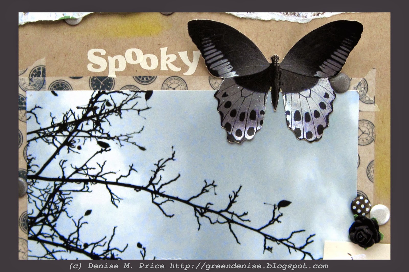
Supplies: cardstock from Bazzill; birchbark paper from Kaisercraft; rub ons & reproduction illustrations from October Afternoon; chartreuse tape from Scotch/3M; clock tape, black roses, & spiderweb charm from Natalie May etsy; chipboard pieces from Scrapmatts; black gesso from Ranger; ink from Clearsnap; butterfly die cut from Dufex; Candi dots from Craftwork; rhinestone from Dee's Place; white netting upcycled from product packaging; striped twist ties upcycled from candy packaging; ribbon upcycled from gift packaging; household pencil.

Denise's layout, "Spooky," embodies the dark side of autumn, especially with the two photos.  The chrysanthemums are white, like phantoms in the moonlight...


...and the bare tree branches are like an evil crone's gnarled fingers.


Denise is playing along with Scrap Around the World, and she used the mood board below.  Specifically, she used the photo in the upper left hand corner of the mood board.  Its pale, timeworn, monochromatic look reminded her of the "ghosts" of autumn.


Many details on Denise's page were influenced by the SATW mood board.  These include: the bird cage, the butterflies, the tulle netting, the string of lights (represented by Denise in pops of yellow and chartreuse), and the abundance of white.  Here are a few detail shots of the page.


Thank you for joining me yesterday and today as I took over Denise's blog.  Denise will be back tomorrow, posting her CPC November reveal as usual.  I, Princess Leia, bid you farewell.  May the Force be with you!

Thursday, October 30, 2014

Autumn: Light Side (B71B)


Hi, I'm Princess Leia, and I'm taking over Denise's blog temporarily.  This is the first of two autumn-themed posts that I'll be making. 

Supplies: decorative papers from Simple Stories; kraft cardstock from Wausau Paper; teal cardstock from Bazzill; stickers from October Afternoon; die cuts from Doodlebug Design; Candi dots from Craftwork; pen from Foray; ink from Hero Arts; upcycled wrapping tissue; upcycled bubble wrap; household pencil.

Autumn is like the Force--it has a light side and a dark side.  Here (above) is a layout that Denise made about the light, bright, colorful side of autumn.


Denise drew inspiration from the October Berry 71 Bleu mood board.  It inspired Denise to scrap many photos of autumn leaves. The individual photos are rather small, but as Master Yoda reminds us, "Size matters not."  In fact, by collaging photos onto regular 4x6" prints, Denise was able to fit twelve--count 'em, twelve--photos onto the layout and still have room for patterned paper and embellishments. 


The flowers in the mood board influenced Denise's choice of a flowery background paper.  She also made her own flowers out of upcycled teal wrapping tissue stamped lightly with bubble wrap.


One of the most striking features of the mood board was the way it contrasted cool blue-green (teal) tones with warm autumn colors.  Denise created similar contrast on her page through the use of layered teal cardstock scraps, a few teal stickers, and the aforementioned teal flowers.


The bright colors of October are fleeting, for they soon give way to the grey tones of November.  That path leads to the Dark Side.  If you're not afraid of the Dark Side, then come back tomorrow for my second post on Denise's blog.  I'll leave you here for now.  May the Force be with you!

Friday, October 24, 2014

Photo Share

Hello, hello!  Is everyone having a good weekend?  I hope so!  It has been awhile since I did a photo share post, so I've got one for you today.  "Rustic" is the prompt word this week over at the Our Beautiful World blog, and I have a rustic barn photo for you to see.  I couldn't resist the texture of the weathered wood and peeling paint.


In this next photo, the visible power lines interfere with the rustic effect.  :)  Still, the tree shadow on the barn looks pretty interesting.


This barn is located at a heritage apple orchard.  It grows only "old fashioned" varieties of apples.  The big excitement when I visited was that the orchard staff had just planted some trees of the Frostbite variety.  Although the University of Minnesota developed this variety back in 1922, the trees only recently became available for commercial sale. 


It will be awhile before this little tree starts bearing fruit...


...but in the meantime, the orchard had plenty of other heritage apple varieties ripe for the sampling.  These apples may be "rustic," but they sure were yummy!


Want to see more rustic photos?  Head over to Our Beautiful World and see what the other participants are sharing this week.


Monday, August 25, 2014

Photo Share (T-Day)


Imagine a day in high summer.  You're walking along the shore of a big, blue lake.  The sun is shining with all its might, but the breeze off the lake keeps you cool.  So does the ice cream cone in your hand.  Yum, it's French Roast coffee flavor.  Ask yourself, does coffee flavored ice cream count as a Tea on Tuesday beverage?  Decide that it does.  You can't take a photo of the ice cream, though, because it's melting quickly in the sunshine.  You can snap a few photos of the lake though.


The lake is not quite as dramatically blue as last time you were here, back in October.  This time, the afternoon sun is casting shadows.  There is still plenty of bright blue to be seen, though, in both the sky and the water.


Your favorite photo is one of your son, framed by some flowers.  He's not facing the camera, but his body language appears peaceful and contemplative.  When you're done enjoying the lake, you can go home and read aloud the library books that he is clutching under his arm.  


What a great summer afternoon!  Hope that you enjoyed reading about it.  Did you feel like you were there with me?  :)

Thursday, July 31, 2014

October!

It's the end of July, and yet today I'm thinking about...October!  I just scrapbooked a couple photos that I took last October, and I used some newly-purchased October Afternoon products to make my page.  It's a match made in heaven.  :)
 
Supplies: textured papers from Carta Bella; stickers, enamel shapes, die cuts, & all other papers from October Afternoon; ink from Autumn Leaves/Stampology; pen from Foray.

This page is called "The Bluest Water."  The photos are from Lake Minnetonka, which is in the western suburbs of Minneapolis.  On the day that I visited the lake, I could not believe how blue the water looked.  The only camera I had with me was my phone, and it's not an iPhone or anything fancy like that, so I worried that my photos would not capture the deep, deep blue hue of the water.  But the phone photos turned out great--I didn't even need to edit them before having them printed!  It really is the bluest water I've ever seen.


If you're a regular follower of my blog, you've already seen another photo from the same day.  It was in this post.  I've posted it again here (above), in case you missed the original post.


Earlier this summer I was visiting some relatives in the Brainerd area, where I found a new (to me) scrapbooking store.  I was able to buy some October Afternoon goodies that I'd been wanting for awhile.  These are my first puffy stickers and enamel shapes.  It's fun to try some new products.

Hope that you've been having fun lately, too.  Take care!

Tuesday, March 4, 2014

Remembering Summer Rain

"Rain" is the inspiration word this week on the photography blog Our Beautiful World.  Hmmm, rain...yes, I think I remember that.  :)  Right now all we have is snow, snow, and more snow here in Minnesota, but we had a lot of rain last summer.  This is what I remember about it...


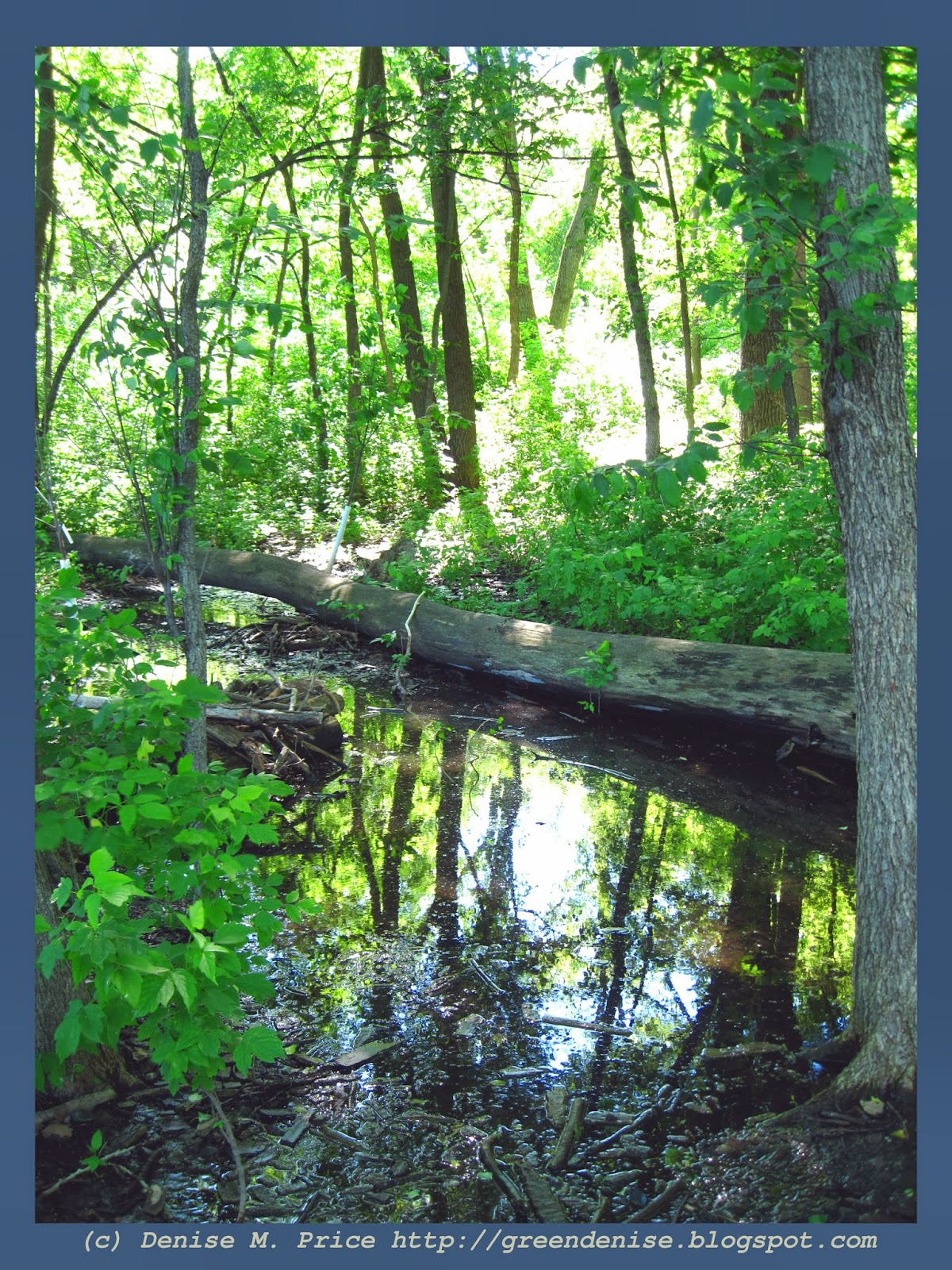
The wetlands were particularly lush and green
because of all the rain.


Heavy rains and lighting storms caused many old trees to fall.


Toadstools and moss thrived in the dampness.


The mechanical dinosaurs at the Minnesota Zoo 
seemed to like the wet weather.  :)


The zoo added mist to the exhibits, but it really wasn't that different from the dampness that already permeated the summer air.


Silver Lake in north-suburban Minneapolis really did look silver on this drizzly day in July.


This sculpture on Silver Lake has endured much inclement weather.


Old fashioned ships on Lake Superior also saw 
their fair share of rain.


This view of Lake Superior from inside Duluth's Great Lakes Aquarium was great...and dry!


Another way to appreciate rain while still staying dry is to visit the rainforest room of Saint Paul's Como Park.  Sprinklers and misters make it "rain" inside the room at twenty minute intervals, but visitors can shelter beneath woven roofs. 


All that rain keeps Como's hanging flowers fresh and pretty.


Thanks for stopping by my blog to see all my rain-themed photos from last summer.  To see more rainy-day images from around the globe, check out the Our Beautiful World blog.